
Overview
Application
Visual Identity Elements
Visual Identity Application
Overview
Establishing our Tone of Voice
Our ‘tone of voice’ is a natural extension of our brand. It is an important tool to align everyone in the OT&P ecosystem to understand who we are and what we do. This document provides a set of guidelines that define quality wording and usage of phrases to appropriately convey our brand’s personality, create a conversation with our staff and patients, and communicate in a consistent and recognisable way of ours.
The voice of OT&P is informational and professional, which establishes the foundation of our brand personality.
The informational tone is used primarily to inculcate a sense of trust among our potential patients. By capitalising on thought-leadership, the goal is to educate our readers with a concise copy for maximum legibility.
The professional tone is where OT&P’s brand values come to life. It blends a sense of warmth along with the assertive nature of our writing.
Using both informational and professional tone allows the brand to create space for relevance, connection and self-awareness.
The Core Principles of 3E'S
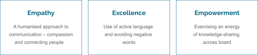
1. EMPATHY
OT&P’s patient-first approach is to ensure every patients’ needs are met.
If someone is visiting our website, there’s a good chance they are already feeling vulnerable. Being cognizant of their need, our tone should be friendly and full of compassion to provide them with a sense of security.
Being friendly does not mean using humour. Humour might give them the impression that we are being inconsiderate and do not understand what they’re going through. On the other hand, extreme formality might make them feel that we are unapproachable. It is best to strike a positive and empathetic tone, somewhere in the middle of the courteous scale.
Example 1: Bring the services of OT&P to life by focusing on the people who provide them. We connect with people by talking about people and not products. This creates an empathetic tone that shows we understand their situation.
See in the application below:
Example 2: Avoid using words that that direct towards stigmas
❌ Autistic Child
✅ Child with autism
2. EXCELLENCE
OT&P strives for continual improvement and a standardised flow of information.
We ensure our information is accurate and is reflective of our top-grade medical standards.
We focus on the energy that we give to people - the energy of reassurance, credibility and helping others with excellence.
For example: Use active language and ensure that a problem is supplemented with a solution.
❌ Infections are common in any type of hernia surgery.
✅ A hernia surgery may cause a post-surgery infection in particular cases. Please talk to your doctor about pain management.
3. EMPOWERMENT
To meet the evolving needs of patients and staff, OT&P regularly allocates its resources to upgrade infrastructure, enable staff training and maintain high standards of our IT support. We believe in empowering our staff and patients by educating and helping them with informed decision-making.
However, medical terms and processes for non-medical staff and patients can be intimidating. It is important to communicate more simply, using common or colloquial phrases that are understood by all and are to the point.
For example: Use concise sentences to showcase your expertise. Avoid using jargons. Use acronyms and abbreviations only where appropriate in a set format.
❌ OT&P has a dedicated gastroenterology service with a specialised team of general surgeons, experienced in providing careful diagnosis, tailored treatment and comprehensive aftercare for patients with all kinds of surgical conditions – from common to the most complicated health issues.
✅ OT&P has a dedicated general surgery service with a specialised team of surgeons. With a focused, tailored treatment, OT&P Healthcare ensures a comprehensive after-care for patients with all kinds of surgical conditions – from common to the most complicated issues.
Our Brand Personality
Our values build our personality. It combines our ethos to shape the brand OT&P under two key pillars – professional and informational.
OT&P IS A PROFESSIONAL BRAND
Our professional brand personality is communicated through our values of empathy and excellence.
While empathy is depicted using an affirmative tone, our value of excellence uses active language to provide a reality check.
For example: State facts and be transparent. Refrain from including unnecessary details that may confuse the reader.
❌ Acid reflux is when the acid in the stomach and juices flow from the stomach back up into the tube that leads from the throat to the stomach (oesophagus).
✅ Acid reflux occurs when acid in your stomach backflows up into the oesophagus.
OT&P IS AN INFORMATIONAL BRAND
In-depth experience drives thought leadership. With an array of specialised medical practitioners and healthcare services, we are wealthy in knowledge and information inflow.
Our tone should exercise empowerment. A clear, authoritative tone demonstrates confidence in our experience and expertise. Do not overcomplicate with lots of unconnected approaches.
Being authoritative shouldn’t mean that we’re patronising or being pompous. It’s more about showing that we know what we’re talking about. It means we offer valuable content that helps them stay in the know-how of the healthcare systems of Hong Kong.
For example: Demonstrate theories that are put to the test and are proven. As good as a theory may be, it hasn’t achieved anything until it’s been successful in practice. This means we pass on the knowledge supported with case studies and testimonials, leaving no room for speculations.
❌ Everything you need to know about the ongoing pandemic COVID-19
✅ COVID-19: A clear distinction between the disease and epidemic
Application
The Tone of Voice in Action
Bringing a brand personality to life can be tricky. Here is a range of examples to help you. These are examples taken straight from our ongoing practice that is rewritten to show how the OT&P tone is established and some useful notes on the differences.
EMPHASIS ON BRITISH ENGLISH:
Some of the common mistakes to note that ensures OT&P’s voice is always in British English and not American English:
Differentiators |
British English |
American English |
| -our / -or | favourite, colour, neighbour | favorite, color, neighbor |
| -ise / -ize ; -yse / -yze | realise , analyse | realize , analyze |
| -re / -er | theatre , centre | theater , center |
| -ogue / -og | catalogue | catalog |
| -se / -ce | practise(v) or practice(n) | practice |
| Retained ligatures | orthopaedic , encyclopaedia, manoeuvre | orthopedic, encyclopedia, maneuver |
| Other oddities | aeroplane | airplane |
| artefact | artifact | |
| cheque | check | |
| cosy | cozy | |
| grey | gray | |
| enquire | inquire | |
| Mum | Mom | |
| pyjamas | pajamas |
- British English spelling will trump local HK medical terminology & references.
Website
The difference:
- The term customer diminishes the value of the brand – empathy. It makes it sound very blunt, like a commercial business offering healthcare services rather than a doctor who will help cure the pain.
- Driving consistency in addressing the stakeholders. The subheader talks about the patient's needs and is not in sync with the main header.
- A simple change in terminology softens the overall copy.
Writing a Blog
1. HEADLINE
The headline is the first interaction of a prospective patient with your brand. As serious as the issue may be, a headline should affirm to the patient that he/she may find a solution at the end of its reading of long-form content. This establishes OT&P’s thought leadership in being an informational brand.
For example: Is there a place for diet and lifestyle in the prevention of severe COVID-19 infection?
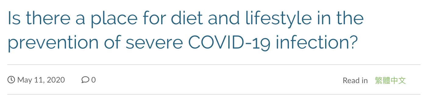
❌ The blog headline is too long
❌ It is seemingly confusing
Here are some recommended headlines for this blog:
✅ Tips to stay healthy during Covid-19.
✅ What is Metabolic Syndrome?
2. BODY COPY
When writing a blog, don’t generalise statements that may mislead the patient/reader:
❌ In some cases, your doctor may recommend a colectomy as a treatment option.
✅ Your doctor can make recommendations for the best treatment options.
Always remember to have an assertive tone than an unsure tone. This does not mean giving straight advice.
❌ The section infected by cancer might need to be removed before it spreads and infects the entire organ.
✅ Post assessment, the section infected by cancer will be removed before it spreads and infects the entire organ.
3. BLOG CITATIONS
Using Harvard style referencing, the footer of the blog should collate a references section consisting of the below elements:
- Author of message
- The year that the site was published/last updated: (in round brackets)
- Title of message: ‘in single quotation marks’
- Title of internet site: in italics
- Day/month of posted message
- Available at: <URL>
- [Accessed: date].
References should all be listed at the end of the blog, in Harvard style. Corresponding to the footnote number in the blog text.
- Non OT&P in-text citations should be in the text similar to footnote references.
For Example:
ADHD affects 6.4% of children and adolescents in Hong Kong ^ [1]
Sasha Gonzales. (2018). ‘A mother’s battle with postnatal depression, and how she overcame it.’ South China Morning Post. 2nd May. Available at: <https://www.scmp.com/lifestyle/health-wellness/article/2144284/postnatal-depression-its-causes-symptoms-and-consequences>[Accessed 26 March 2020].
- OT&P related citations should be a hyperlink in the text.
For Example: Contact OT&P Healthcare
4. BLOG SOURCES/REFERENCES:
- HK-related medical associations (DH, CHP, Cancer-Fund.org)
- British-related medical associations (NHS, British Cancer Association, NICE)
- Neutral medical sources (Healthline, WebMD, WHO)
- American-related medical associations (CDC, American Cancer Society, NCI)
- News articles (SCMP, Healthy Matters, Tatler, etc.)
Knowledgebase
OT&P’s Knowledgebase is a one-stop library for commonly-asked questions related to a variety of medical conditions.
It is a collection of bite-sized articles in Q&A format, addressing specific issues, questions or problems that a target audience may have. It serves the purpose of educating the patient on topics that they are particularly interested in.
A knowledgebase entry is different from a blog because it answers specific questions in short-form. Whereas, a blog is long-form content that elaborates on a particular topic in detail.
Format
The example below demonstrates the format of KnowledgeBase:
(All categories marked * are mandatory)
| Particulars | Example |
| Category* | Gynaecology |
| Sub-Category* | Breast Cancer |
| Question* | How often should I get a Mammogram? |
| Answer* |
The frequency of your mammogram depends on your age and family health history.
Depending on their family health history and individual conditions, some women may be recommended for a screening using both a mammogram and an MRI. |
| Credit to Practitioner | Information provided by <Doctor’s name + Title> *No hyperlinking to OT&P doctor profile |
Knowledgebase versus Blogs
| Blogs | Knowledgebase | |
| Purpose | Help patients discover in-depth knowledge on certain topics. | Help patients find answers to their problems. |
| No of Words | Up to 2000. | Ideally, not more than 250. |
| CTA | Yes | No |
| Format | Essay-like | Q&A |
| Content Type | Long-form | Short-form |
| References Needed? | Yes | Optional |
| Practitioner's Name Needed? | Optional | Optional |
Social Media
1. SOCIAL MEDIA BIO
Aligning owned media channels is key to showcasing consistency, reiterating our values and pushing forward our brand personality among our existing and potential patients. All touchpoints on social media footprints must reinforce a consistent bio that creates an image of the brand OT&P and sticks in the patient’s mind.
OT&P Linkedin Bio V/S OT&P Instagram Bio
Linkedin bio rightly uses a soft tone while affirming to the patient that we are best in class to be trusted by using terms such as ‘leading’, ‘you and your family’.
Instagram bio rightly uses an authoritative tone to reflect industry experience and drive on goodwill. But it misses the warmth.
Recommended bio across all social media platforms:
✅ We are Hong Kong’s leading family clinic with over 25 years of experience, providing healthcare for you and your loved ones.
✅ OT&P, a group of leading medical practitioners in Hong Kong, provides healthcare for you and your family.
2. SOCIAL MEDIA POSTS – BEST PRACTICES
✅ Choose primary and secondary platform: Facebook & Linkedin (primary); Instagram (secondary) and curate content according to platform’s target audience.
✅ Focus on these type of content to post: Educational & Informative blogs, Awareness Months, People Culture, Packages & Services, Practitioners Profiles, Quick Tips & Advice, Accomplishments, etc.
✅ Content Formats: Video & Image (primary); Infographic (secondary)
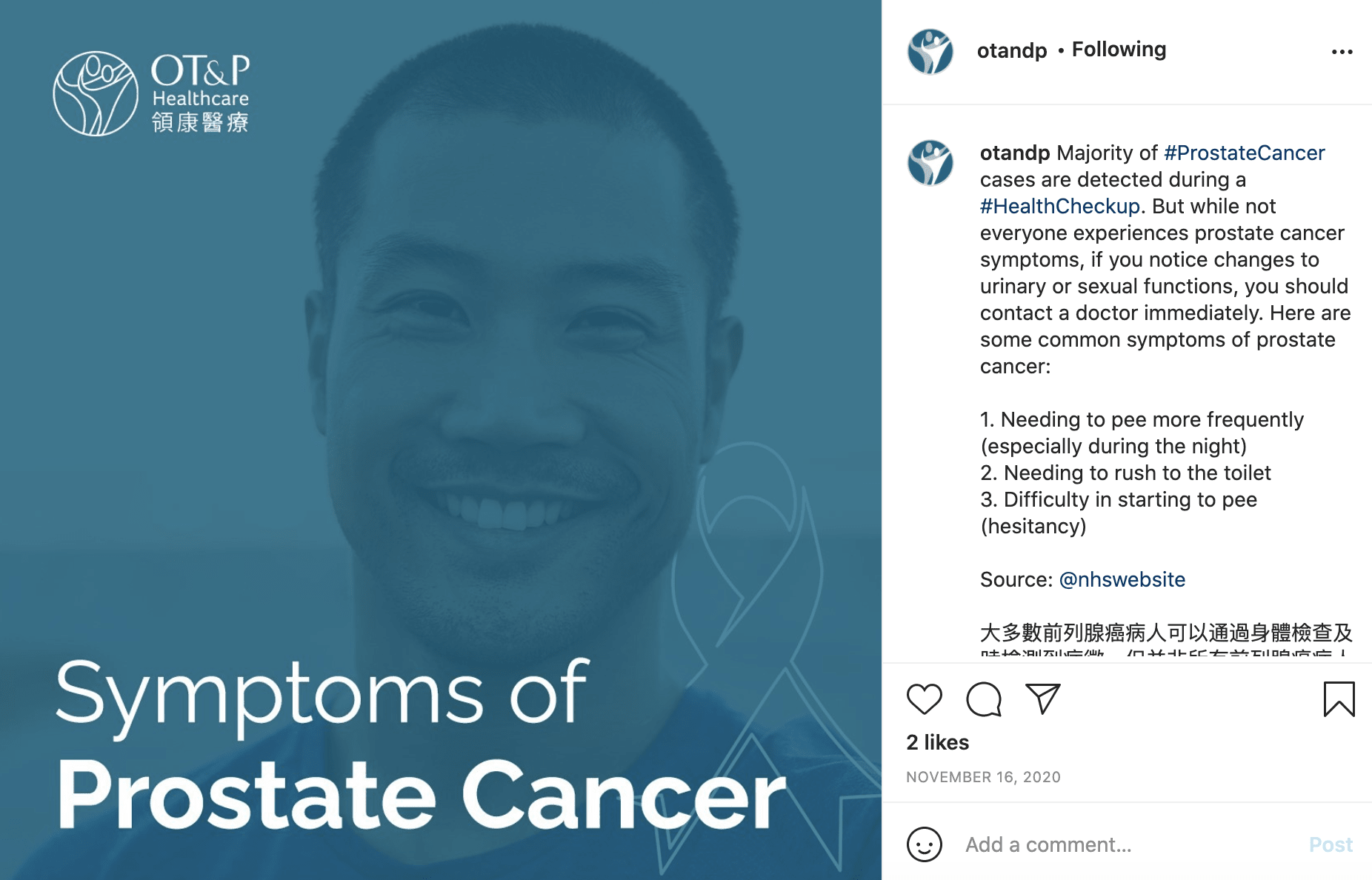 OT&P Social Media Post
✅ Timeliness: Increase share of voice by participating in current topics. For example: Men’s Health Awareness Month.
✅ Informative: Posts should focus on usable information such as symptoms, diagnosis or treatments.
✅Hashtags: Should include pop culture-related hashtags at the bottom of the caption that help target a specific audience (in this case, #Movember, #MensHealthAwarenessMonth #MensHealth)
✅Creative Standardisation: It is important to standardise visual elements. Use brand logo sparingly and stay true to primary colour palette.
.png)

Post 1: With logo VS Post 2: Without logo
3. USE OF EMOJIS
Emojis should be used sparingly and only if they serve a purpose in the copy. Using emojis to break up text and include lists is justifiable, but too many emojis can have a detrimental effect on the brand image.

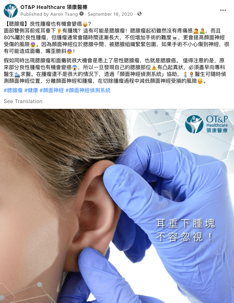
✅ An integral part of copy structure: OT&P used emojis as a way to separate items in a list, which makes the text easier to skim through
❌Expressive use: Emojis to express emotions should be used sparingly
4. CHINESE VS ENGLISH POSTS
✅ Caption Standardisation: It is beneficial to have one concise post with both English and Chinese translations.
❌ Avoid Duplication: 2 separate posts on the same content is overwhelming.
5. ADDING THIRD-PARTY LINKS
Some third-party pages may not have a featured image enabled. This means that when sharing a third-party link on social media, no image will be displayed. In such a scenario, it is best to include a social image related to the shared content.
✅ Always mention the ‘Source’ at the bottom of the caption when providing information + tag.
✅ Always use a colon (:) or a hyphen (-) when providing links.
✅ When promoting a well-known health event/day/charity, the OT&P Facebook page should proclaim their support under the Check-In section. See screenshot below:
6. TAGGING THIRD-PARTY BRANDS

Any piece of social media content that mentions a third-party brand should include a ‘@mention’ to the brand’s social media page wherever applicable. For example, the post below rightly shares a video by the MD Anderson Cancer Center tagging the brand’s Facebook page.
Checklist
Whenever you create a copy, think about your patient and your staff again.
Ask yourself:
- Will the patient I’m speaking with understand what I’ve written and relate to it?
- Is it clear?
- Is it simple?
- Is it short?
- Does it empower him/her with knowledge and/or advice?
- Does it answer the questions we set out to answer?
- Is it written from an affirmative yet assertive standpoint?
- Have I removed all the jargon?
General dos & don'ts
BRAND NAME
Consistency is key to good branding, so ensuring the OT&P Healthcare name is communicated correctly in all communications is very important.
✅ OT&P
✅ OT&P Healthcare
✅ OT&P Family Clinic
✅ OT&P MindWorx
❌ OT&P Healthcare Services
BRAND LANGUAGE
The content across all platforms should be in British English at all times, avoiding highly-negative words.
❌ Issue, Problem, Panic, Suffer, Impaired, Agonise, Tolerate, Severe
TERMINOLOGIES TO ADDRESS
How you address your stakeholders is essential. Do use the term ‘patient’ and not the customer. A doctor-patient relationship has more warmth THAN a clinic-customer.
✅ Patient
✅ Doctor/practitioner/specialist (Please refer to the table below)
✅ Mothers-to-be
✅ Parents-to-be
❌ Mothers-To-Be
❌ Customer
❌ Victim
❌ Sufferer
❌ Consumer
When referring to doctors, practitioners and specialists (depending on the qualifications held by the subject matter expert) - you can follow the below:
Doctor |
Practitioner |
Specialist |
| General Practitioner All under specialists |
Physiotherapy Osteopathy Psychology & Counselling Dietetics Podiatry Midwifery Naturopathy Optometry Functional Medicine Speech Therapy Sports Medicine Psychoeducation & Assessments Health Coaching |
Family Medicine General Surgery Obstetrics & Gynaecology Paediatrics Dermatology & Venereology Otorhinolaryngology (ENT) Gastroenterology & Hepatology Orthopaedics & Traumatology Neurosurgery Cardiology Plastic Surgery Paediatric Surgery Ophthalmology Urology Medical Oncology Psychiatry Anaesthesiology Pain Management Cardiothoracic Surgery Otorhinolaryngology Orthopaedic Surgery |
Note 1: Some services will have their set labels.
For example: For psychology, you will say psychologists. For paediatrics, you will refer to them as paediatricians.
Note 2: If you are generalising a whole clinic with multiple types of members (e.g., mental health), address them all as ‘practitioners.’
USING BULLET POINTS:
Use these to break up long sentences. Make them concise. Punctuate with full stops as this supports the decisive nature of our brand.
For example:
❌ 5 Reasons Online Learning is Hard For Some Children
Given the long-form nature of this blog, it is best to provide a reader with a quick summary at the start to explain what an entire blog will dive deeper into:
5 Reasons Online Learning is Hard for Some Children:
✅ Why is online learning so difficult? With many schools turning to online learning to teach their students, virtual learning is still something both the parents and child are not adept with. Here are some of the possible roadblocks causing resentment:
- The compartmentalisation of physical space in children’s mind
- Distractions at home
- Loss of social interactions and familiar routine
- The new role of parents to wear multiple hats
- The skill demand vs adoption time
USAGE OF CAPITAL LETTERS:
Addressing the practitioners and their job titles: If a job title is attributed to a doctor, it should have capital letters without punctuations.
For Example:
❌ Dr. Tim trodd, family medicine, functional medicine, general practice
✅ Dr Tim Trodd, Family Medicine, Functional Medicine, General Practice
MEDIA QUOTES, PRESS RELEASES:
Always Bold the spokesperson name. The quote should be in italics. Only use ‘single’ speech marks when highlighting a direct quote from someone. Close the quotation marks first, then write the period or comma.
For example: https://www.otandp.com/blog/vitamin-d-and-covid-19
❌ Charles Bangham, professor of immunology at Imperial College London and co-author of the Royal Society paper, said: “I started from quite a sceptical position, doubting whether vitamin D was going to play an important role in COVID-19, but I am now convinced that there is strong evidence that people who are deficient in vitamin D are more susceptible to acute respiratory tract infections.”
✅ Charles Bangham, Professor of Immunology at Imperial College London and Co-Author of the Royal Society Paper, said: ‘I started from quite a sceptical position, doubting whether vitamin D was going to play an important role in COVID-19, but I am now convinced that there is strong evidence that people who are deficient in vitamin D are more susceptible to acute respiratory tract infections’.
ACRONYMS:
Acronyms can be a real barrier to communication. Especially if you assume the patient knows what the acronym stands for. If you must use acronyms, please ensure you write out what they mean in brackets on your copy’s first appearance (you can then revert to using the acronym). The initial letter of each acronym should always be uppercase.
❌ External cephalic version (ECV)
✅ ECV (External Cephalic Version)
POINTS OF VIEW:
✅ When talking about us as a brand, always use the first-person narrative: ‘We’, ‘Ours’
✅ When writing a blog that includes an opinion or opinionated tone, use ‘I’, ‘Me’.
✅ When addressing a patient, potential patient or staff, we want to use a more compelling writing method, so use the second person narrative: ‘You’.
❌ Personal opinions by doctors on healthcare systems of the country, views on industry trends should NOT be associated with the brand OT&P or form a narrative that displays your view as an official representation of OT&P Healthcare.
COMMON CONTRACTIONS:
Using common contractions will make it warm and friendly, but don’t use too many – becoming over-familiar will make our tone of voice too ‘chatty’, diluting its professionalism.
- You will – You’ll
- We have – We’ve
- We are – We’re
- We will – We’ll
- Will not – Won’t
- You are – You’re
- You have – You’ve
THE AMPERSAND (&):
Please use ‘and’ within body text rather than the ampersand. The ampersand can be used in headlines and social media when you need to keep your headline/post as short as possible.
Visual Identity Elements
OT&P Brand Logo
OT&P’s logo recognises the importance of community and family, while also expressing high-quality healthcare standards. The symbol focuses on a sense of well-being, good health, security and happiness. It promotes a view of health that speaks of positive and proactive notions, rather than the negative and reactive images connected with the traditional idea of sickness. The symbol depicts two figures standing next to each other in a subtle embrace, giving rise to feelings of trust, companionship and cooperation.
One of the hallmarks of a successful brand is consistency. Therefore, all those who apply our logo and supporting elements should do so with a concerted effort to maintain its integrity.
This document will guide users in maintaining consistent brand elements while applying the logo in its different uses. Everyone within the OT&P ecosystem should plan any visual communications materials as per this guideline.
OT&P Primary Logos
The OT&P Healthcare primary logos encompass the comprehensive care solutions, BodyWorX, MindWorX logos, and our various service and sub-brand logos. Each Logo is meticulously crafted with two core components: custom typography and the distinct OT&P emblem. These elements streamline and consolidate our brand identity and significantly enhance recognition and perception across our healthcare services and products.


OT&P Orientations & Configurations
The OT&P logo comprises two elements - the logo graphic (A) and the logotype (B).
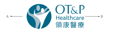
The configurations of the OT&P logo are set in fixed positions relative to each other and cannot be altered. You can use two specific configurations of the logo: the horizontal and vertical or stacked version. The logo can also be used in two style variations, either colour filled or linear, as shown below.
Horizontal Logo


Vertical Logo


Clearspace & Sizing
Whenever the logo is used, it should be surrounded with clear space to ensure its visibility.
The clear space around the logo is shown below.
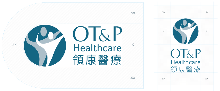
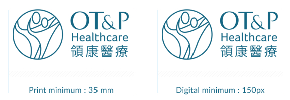
Minimum Sizes
The logo can be used at different scales, but ensure that the alignment is intact when using it at smaller sizes. To ensure legibility, you should never use the logo that is smaller than 35mm for print documents and 150pixels for digital.
Guidance of use
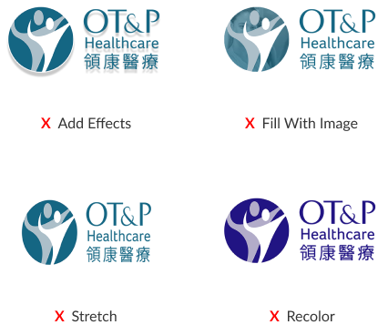
- Do not stretch, skew or compress the logo.
- Do not add effects to the logo.
- Do not change the proportion of the logo elements concerning one another.
- Do not swap the colours assigned to the logo elements or assign different colours to any, or all logo component.
- Do not place the logo on a distracting or clashing background. This includes using similar colours where the logo can't stand out.
- Do not tilt or rotate the logo.
- Do not create outlines around the logo to create contrast.
- Do not substitute any typefaces or font attributes (e.g. italic or bold).
The OT&P Healthcare primary logos encompass the comprehensive care solutions, BodyWorX, MindWorX logos, and our various service and sub-brand logos. Each Logo is meticulously crafted with three core components: custom typography, the distinct OT&P emblem, and the cohesive staging platform. These elements streamline and consolidate our brand identity and significantly enhance recognition and perception across our healthcare services and products.
Colour Palette
Colour plays a critical role to build brand recognition. Consistent use of these colours will contribute to the cohesive and harmonious look of OT&P’s brand identity across all relevant platforms.
Primary Colours
Deep Blue is the primary colour used and is a recognisable identifier for the OT&P brand. Use it as the dominant colour for all internal and external visual presentations of the company.
Deep Blue
Secondary Colours
The secondary colours help complement and highlight our primary colour. They are especially useful when dealing with complex applications. But they are not recognisable identifiers. Use these colours sparingly.
CTA colour
Text colour
Icons
Icons are a foundational building block of OT&P’s illustrated content. The styling suite of our icons is a combination of crisp, geometric line work with subtle rounded corners. They are minimalistic, aesthetic and timeless, aligning with OT&P’s design-centric approach.
Functional Iconography
The standard icon size for the OT&P icon suite is 24x24px. But can also be expanded into the desired dimensions. Icons can be either squared or rounded on the end caps.
Icon styles can either be filled or linear (see reference below). Each icon has the same visual weight, so they all feel like they are the same size, regardless of their overall shape.
Filled Icon
Linear Icon
Outlined icons
Solid icons – single colour
Solid icons – two colour
Website Principles
The OT&P Healthcare website is available in two official languages: English and Traditional Chinese. The website is designed to ensure a visually consistent user experience as users navigate across it.
Everyone within the OT&P ecosystem with access to edit our website is required to comply with these standards. This guide aims to follow the best practices to adopt the appropriate tone regarding public communication.
Imagery, banners, text sizing, spacing, navigation and other key visual elements of our website are detailed below. Our goal is to ensure that our branding is consistent with our digital footprint.
Imagery
Below is a list of the best practices for the appropriate use of images on the OT&P website:
- The image type should consist of human emotions.
- The images should not be in the form of animated graphics.
- All images should be high-definition with at least 72 ppi. The size will depend on the type of page and display requirements. For example, a featured image for any blog on the website should be 760x330 pixels.
- Always insert Alt Text to provide a description of the image on the webpage. This helps search engine crawlers and screen reading aids to understand what the image is about.
- Avoid using flickering, blurry and pixelated images.

Banners
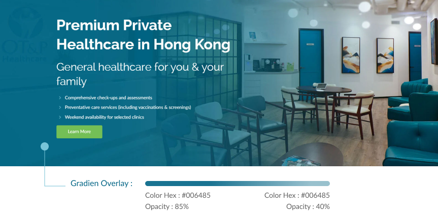
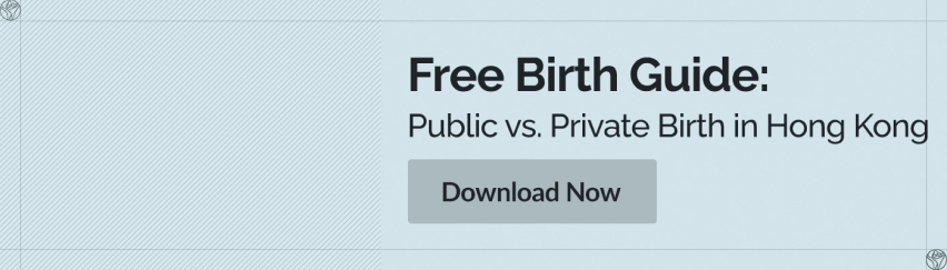
OT&P banners are an effective way to communicate our main message with readers. Please see the guidelines below to understand how each banner type functions:
Hero banner / Homepage
Inner page banner
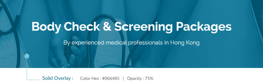
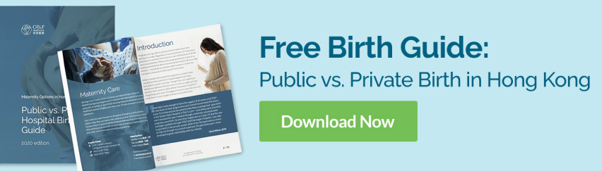
Featured image

Text Sizing
Our website content involves service pages, blogs, podcasts, announcements and more. Some of them are text-heavy pages. For a seamless reading experience, as well as for search engine value, the basic hierarchy to remember is as below:
- Header font size and style: Your primary page header should be the H1. There should also only be one H1 per page.
- Secondary font size and style: Sub-headers, or secondary headers, should always be H2. Use it for subsection titles. This continues further down the hierarchy, tertiary titles should use H3 and quaternary H4’s.
- The default font size used on the website is 16 px. This should be used for all body text – as well as most controls, like text boxes, dropdowns, buttons, and menus.
The below illustration sheds light on the text hierarchy and associated font size:
Headers & Sub-Headers Sizes
OT&P Healthcare
H1: Font-Size: 48px (3em)Font-Weight: Semi-Bold (600)Line-Height: 1.042
OT&P Healthcare
H2: Font-Size: 38px (2.375em)Font-Weight: Regular (400)Line-Height: 1.184
OT&P Healthcare
H3: Font-Size: 30px (1.875em)Font-Weight: Regular (400)Line-Height: 1.267
OT&P Healthcare
H4: Font-Size: 25px (1.5625em)Font-Weight: Regular (400)Line-Height: 1.4
Spacing
The spaces between lines, letters and paragraphs should be consistent and clear.
For example, the space between the H1 header and the body text should be 16px. Please see the below illustration of varying levels of spacing available.

Typography
Typography plays a vital role in communicating an overall tone and quality. Careful use of typography reinforces our personality and ensures clarity and harmony in all our communications.
The primary typefaces for OT&P web communications are Raleway (Headlines) & Lato (Body).
A clear hierarchy is critical for a professional and creative type system. The following guideline helps organise a clear and logical order for the header & body content.
Headline Font
Raleway
This font is published under the Open Font License by Google, available across desktops and web fonts.
OT&P Healthcare
ABCDEFGHIJKLMNOPQRSTUVWXYZ
abcdefghijklmnopqrstuvwxyyz
OT&P Healthcare
ABCDEFGHIJKLMNOPQRSTUVWXYZ
abcdefghijklmnopqrstuvwxyyz
OT&P Healthcare
ABCDEFGHIJKLMNOPQRSTUVWXYZ
abcdefghijklmnopqrstuvwxyyz
OT&P Healthcare
ABCDEFGHIJKLMNOPQRSTUVWXYZ
abcdefghijklmnopqrstuvwxyyz
OT&P Healthcare
ABCDEFGHIJKLMNOPQRSTUVWXYZ
abcdefghijklmnopqrstuvwxyyz
OT&P Healthcare
ABCDEFGHIJKLMNOPQRSTUVWXYZ
abcdefghijklmnopqrstuvwxyyz
Body Font
Lato
This font is published under the Open Font License by Google, available across desktops and web fonts.
OT&P Healthcare
ABCDEFGHIJKLMNOPQRSTUVWXYZ
abcdefghijklmnopqrstuvwxyyz
OT&P Healthcare
ABCDEFGHIJKLMNOPQRSTUVWXYZ
abcdefghijklmnopqrstuvwxyyz
OT&P Healthcare
ABCDEFGHIJKLMNOPQRSTUVWXYZ
abcdefghijklmnopqrstuvwxyyz
OT&P Healthcare
ABCDEFGHIJKLMNOPQRSTUVWXYZ
abcdefghijklmnopqrstuvwxyyz
OT&P Healthcare
ABCDEFGHIJKLMNOPQRSTUVWXYZ
abcdefghijklmnopqrstuvwxyyz
OT&P Healthcare
ABCDEFGHIJKLMNOPQRSTUVWXYZ
abcdefghijklmnopqrstuvwxyyz
Chinese Font
Ping Fang
Ping Fang provides six-word weights, and the font-family is defined as below.
标题
标题
标题
标题
标题
标题
Principles of CTA
The Call-to-Action (CTA) is a primary element for all our digital communications across the web, social media and emails. CTA’s should stand out from the surrounding content to command attention. Please ensure to use enough negative space around the CTA’s.
Adhere to the below guidelines when incorporating CTA’s:
CTA Button
The size of the CTA button should stand out in comparison to web text.
When using the CTA button on a light background, OT&P primary colour palette should be used (see example below on Hex: #5cb876)
Buttons on light background
Normal
on Hover
When using the CTA button on a dark background, the background should be white.
Buttons on Dark background
Normal
on Hover
Banner CTA
The banner CTA format involves four primary elements - a banner, imagery, text overlay and a CTA button. The entire banner will always be hyperlinked. Each banner CTA adheres to a combination of the primary and secondary colour palette.
Banner CTA Construction
Graphic Device
Graphic Device is an amalgamation of shapes and other visual elements that make the OT&P brand instantly recognisable in print and digital mediums.
Usage
A tapered parallel pathway shape is a key identifier for the OT&P brand. It is an extension of our logo, emphasising the figures’ embrace.
Our graphic device allows for flexibility and usability across digital and print collaterals, but should follow these rules:
- It should point outwards or anchor a focal element in any communication.
- It tapers in an upward direction.
- Should be used on covers for print and digital collaterals.
- Use it sparingly and with intent.
- Use it subtly over CTA’s or banner imagery with increased opacity.
- Use one shape per visual or asset, never multiple.

Visual Examples
Below are two print & digital collaterals of a graphic device for a brochure and CTA.

Visual Identity Application
Stationery
Each of our stationery elements should include the logo, primary colour palette and graphic device to elegantly and consistently illustrate our brand.
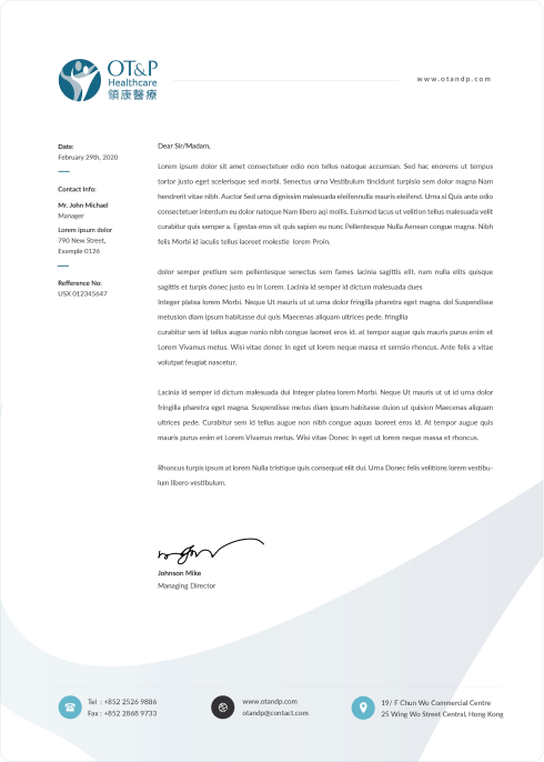
Letterhead Design
Expression
The official OT&P letterhead should have a left-aligned and horizontal logo, a graphic device in the footer and functional icons. Do not produce letterhead with alternate designs or with the vertically stacked logo.
Usage
Always use OT&P letterhead for any outgoing official communication such as prescriptions, invoices, medical certificates etc.
Parameters
Dimensions
297 x 210mm
DIN A4
Weight
120g/m uncoated
white
Print
CMYK
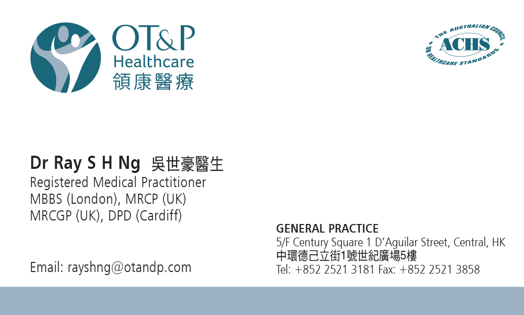
Business Cards
Expression
The front side of OT&P business cards should include the horizontally stacked logo on the left and the ACHS logo on the right. The backside of the card is as shown in the figure below. It should include the OT&P logo in the centre, the website URL, company email and telephone hotline.
Usage
OT&P business cards are a professional way to exchange contact information. It should be adhered to at all times by every stakeholder within the OT&P ecosystem.

Brand Signature
Company signatures endorse and organise all the connected clinical entities of OT&P, under a single healthcare umbrella. They provide a clear emphasis on the sub-divisions while demonstrating their connection to the brand's core values.
The visual elements of the OT&P signature are specifically configured, placed, sized, and rendered in a precise relationship to create a unique visual character.
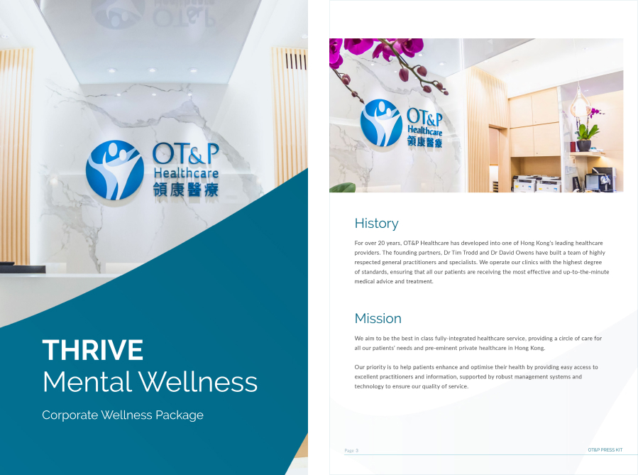
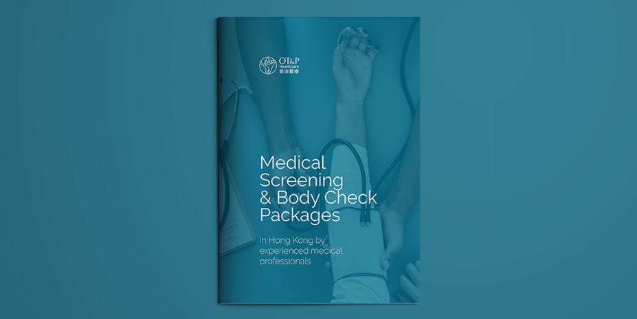
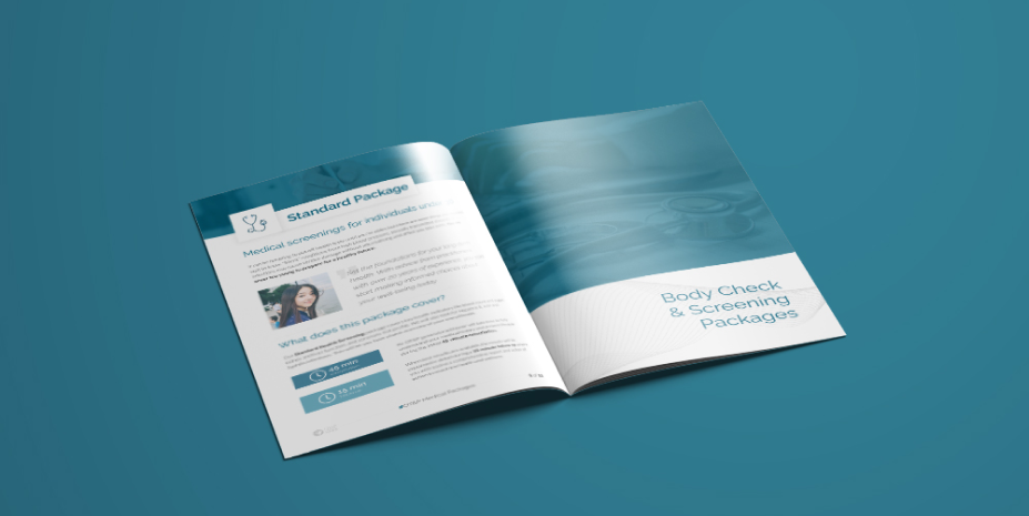
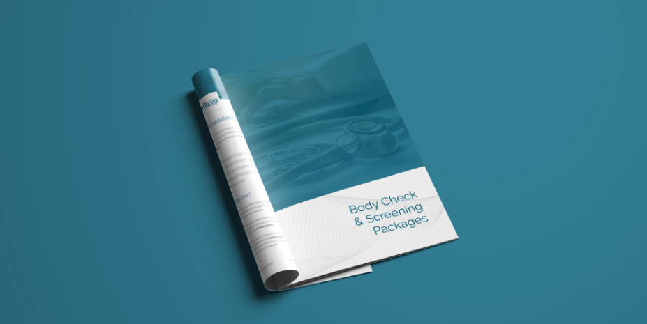
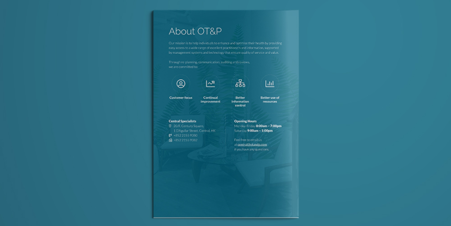
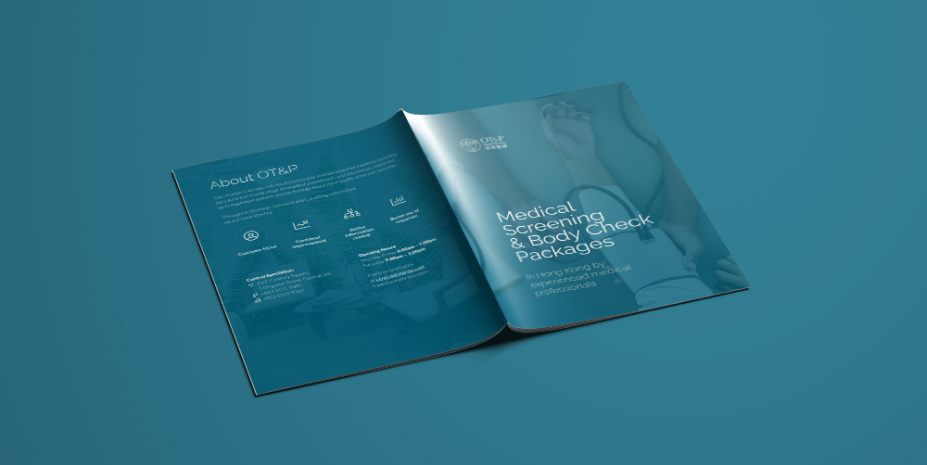
Brochure
OT&P Brochures are a visual marketing asset and a comprehensive way to introduce our services to patients.
Visual Spread
Our brochures consist of a standard design and content template. They are presented in a bi-fold format and the layout consists of a cover, offer, valuable information, a CTA and contact information.
A bi-fold type reads similar to a magazine, from left to right.
Social Media
OT&P's social media content can be grouped into three categories:
- Educational: focused on personal health maintenance
- Topical: focused on current global health issues
- Offerings: focused on promotions
Facebook & Instagram
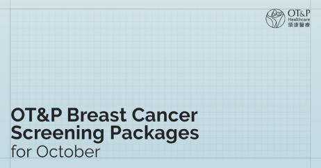
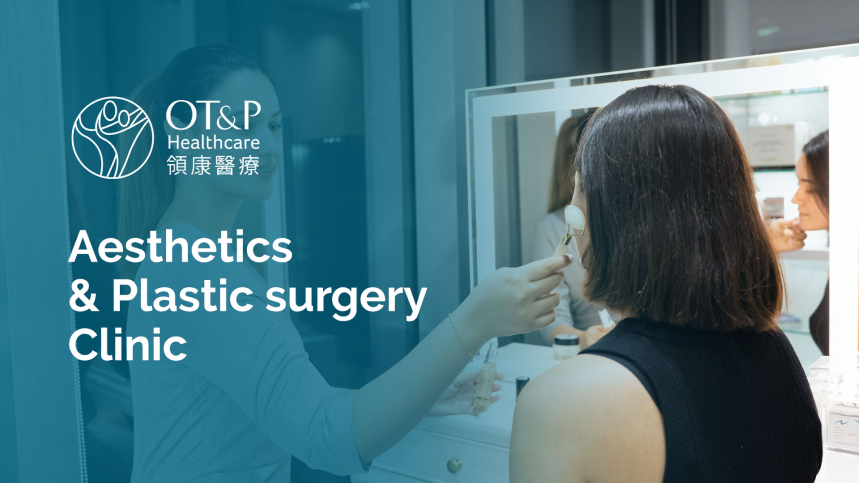
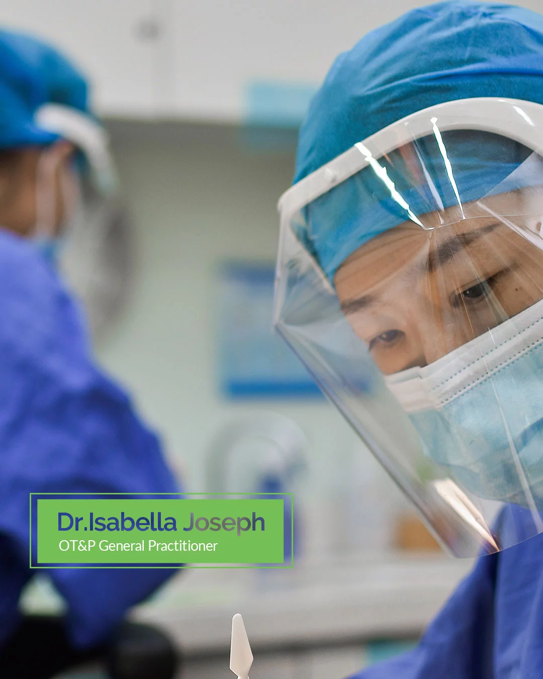
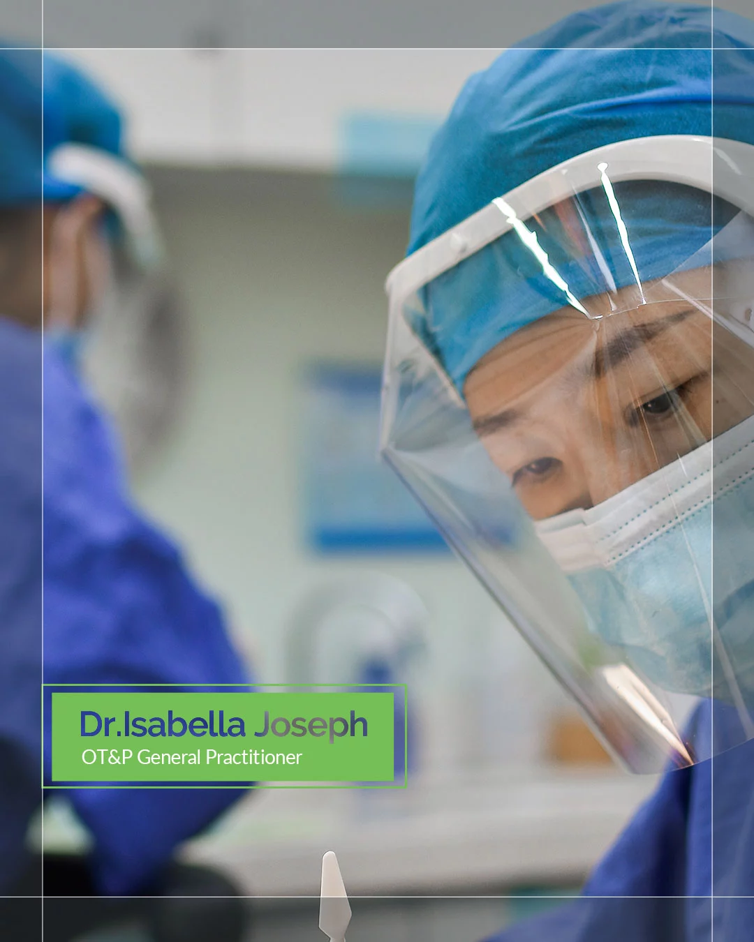
For Facebook and Instagram social media posts, square social images in the size of 1080 x 1080 pixels are preferred. Photos of the clinic or stock images related to the subject should be used as a background. The majority of social images will include a background, a transparent overlay in one of the OT&P blues, as well as white typography and a white OT&P logo. But to avoid fatigue, a coloured photo variant with blue text can also be used.
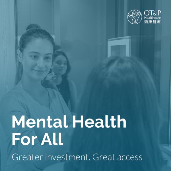
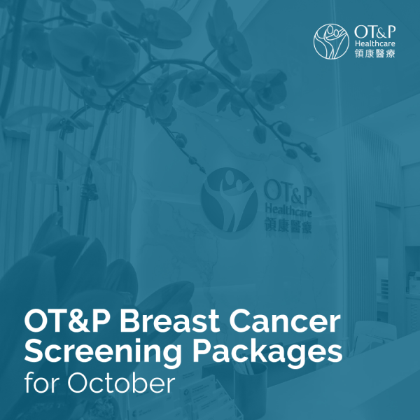
Image Construction
There are two types of social media image layouts, based on the length of the text and the background image. A graphic device or an opaque accent can be placed at the top-left side of the image above the text, in the form of a shaded circle.
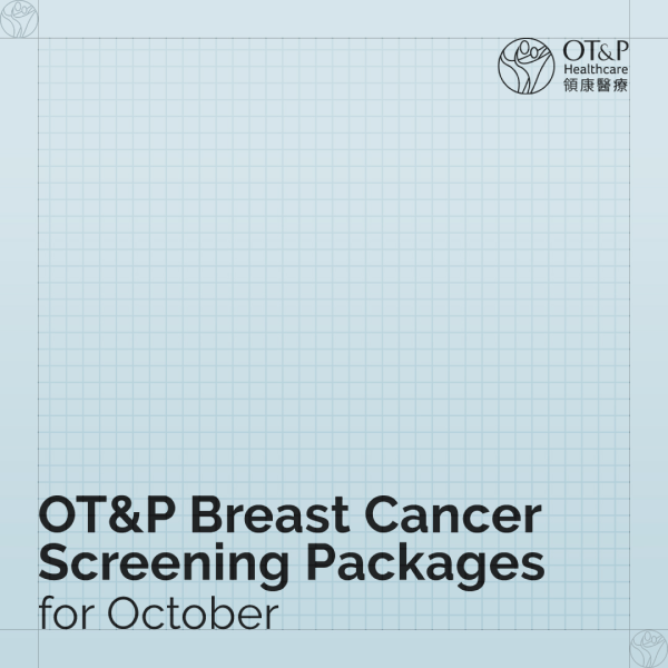
Logo Position
The OT&P logo should always be placed in the top right corner. The logo, along with the English & Chinese typeface should be placed on the right-hand corner of the post, with 1mm white space around.
Typography
The social media image text will be placed at the bottom left corner of the square post and will take up to one-third of the height of the image. There will be the main header in a bold font, as well as a subheader in a default font.
For LinkedIn social media posts, landscape images in the size of 1200 x 670 pixels are preferred. Photos of the clinic or stock images related to the subject should be used as a background. The majority of Linkedin images will include a background, a transparent overlay in one of the OT&P blues, as well as white typography and a white OT&P logo. But to avoid fatigue, a coloured photo variant with blue text can also be used.
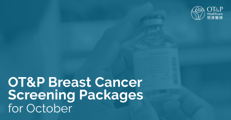
Image Construction
There are two types of image layouts, based on the length of the text and the background image.
Logo Position
The OT&P logo in the image will be placed in the top right corner at all times. The logo, along with the English & Chinese typeface should be placed on the right-hand corner of the post, with 1mm white space around.
Typography
The text should be placed at the bottom left corner of the image and will take up to half of the image height. There should be a line of space between a bold header and default subheader text.
Email Marketing
Email marketing is a crucial component in how we convey our information. This guide will help us create a consistent style to make our messages resonate with our audience. This guide is supplemental to the Master Brand Style Guide, which should be consulted for all matters relating to content creation (typeface, iconography, brand personality and imagery).
Style & Layout
All OT&P emails are built within the HubSpot platform and should adhere to the brand guideline. The emails should follow a standardised template below, using our dedicated colour palette and our established tone of voice for content.
01. Logo Position
OT&P’s horizontal logo should always be positioned on the upper left corner of the email.
02. Hero Image
When appropriate, the email should start with a hero image banner with a blue overlay. This image should either be relevant to the content or should use a standard clinic entrance image. Otherwise, the hero image is omitted.
03. Body Copy
The body copy text of the email should be in default regular size, using Lato typeface. It can have a flexible structure of two or three columns, adhering to the required white spacing requirements.
04. CTA
Every block of body copy should conclude with a CTA, adhering to the CTA guidelines.
05. Footer
Every OT&P email footer should include important information such as address, contact details, social media handles and consent statement on the primary colour palette background.
Video Guideline - Universal
Any video or multimedia, whether produced internally or via an external resource, should aim to meet the OT&P video guideline requirements.
Technical Specifications
Aspect Ratio
Creating an immersive viewing experience is an important element for all OT&P videos. All videos should be shot in a 16:9 ratio.
Video Quality
- All videos should be recorded at a minimum of 1080p HD quality.
- Only when necessary (for slow-motion shots, cropping, etc.) should the video be shot at 720p.
Framerate
- Framerate’s effect on a video should be subtle at 24 fps (true 23.98 fps).
Bitrate
- When possible, you should record all footage at the highest possible bitrate available. This will allow for better colour, detail and video quality in the final product.
Audio
Background Noise
- Avoid locations with background noise whenever possible.
- If audio includes incidental background noise, remove noise whenever possible, without introducing noise-reduction artifacts.
- Wireless lavalier mics should be set to frequencies that avoid frequency noise.
Quality
- Avoid distortion or clipping.
- Speech should be limited to a maximum of -3dB.
- Compression can be used to normalise audio levels, without artifacts or distortion.
Technical Specs for Final Export
- Container: MP4 or MOV
- Audio Codec: AAC-LC
- Sample rate: 48khz
- Video Codec: H.264
- Frame rate: 24fps
Video Guideline - Elements & Styles
This section explains the standardisation process of OT&P videos, such as opening & closing screens, screen construction, subtitles and sizing points.
Video Styling
Opening Screen
Closing Screen
Main Screens
The opening and closing screen of every video should begin with the OT&P logo in different formats. The opening screen logo format should be on a white background, and the closing screen should use the primary colour palette. A white logo typeface should be placed for every subsequent frame on the main screen's upper-right corner
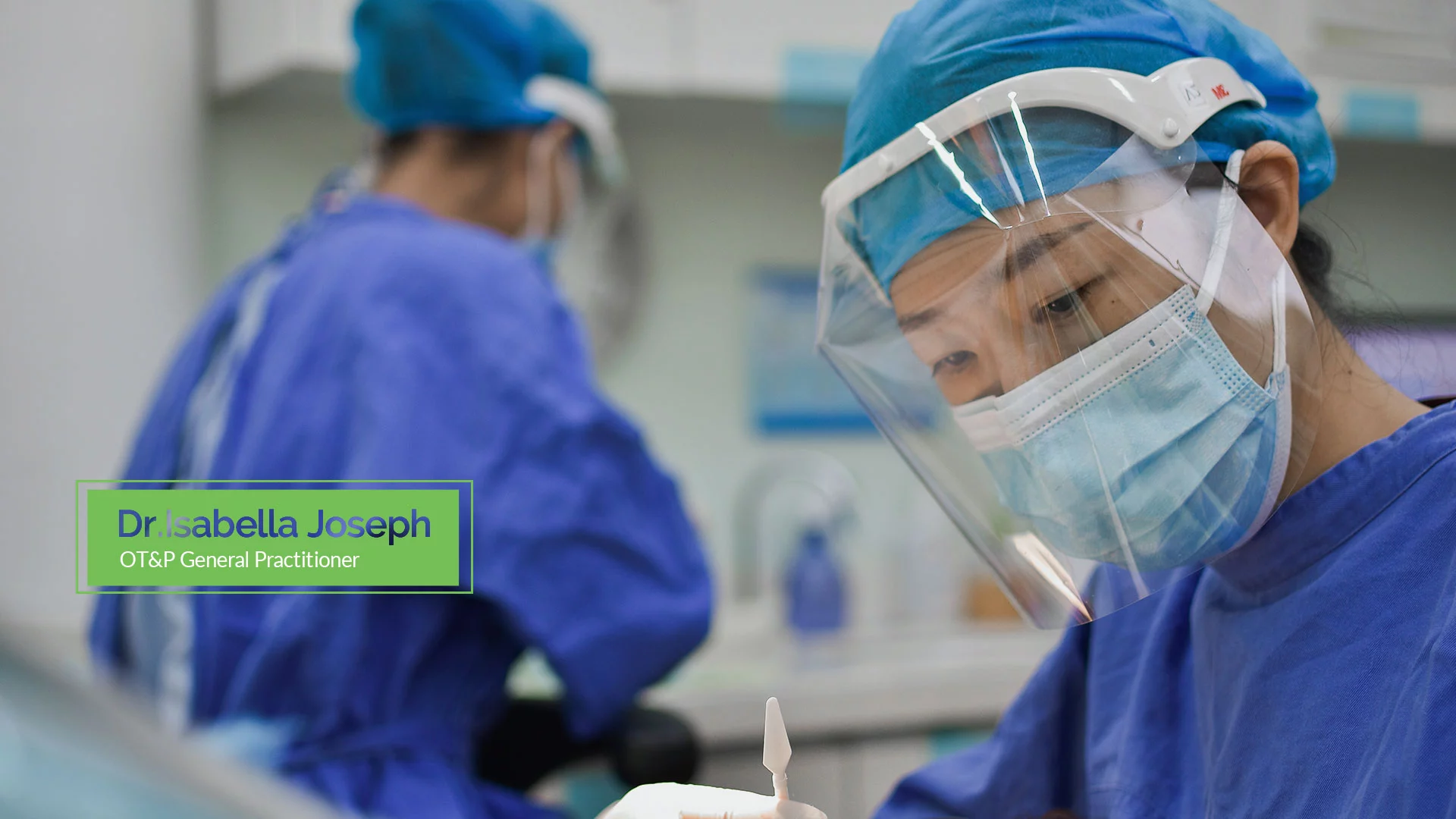
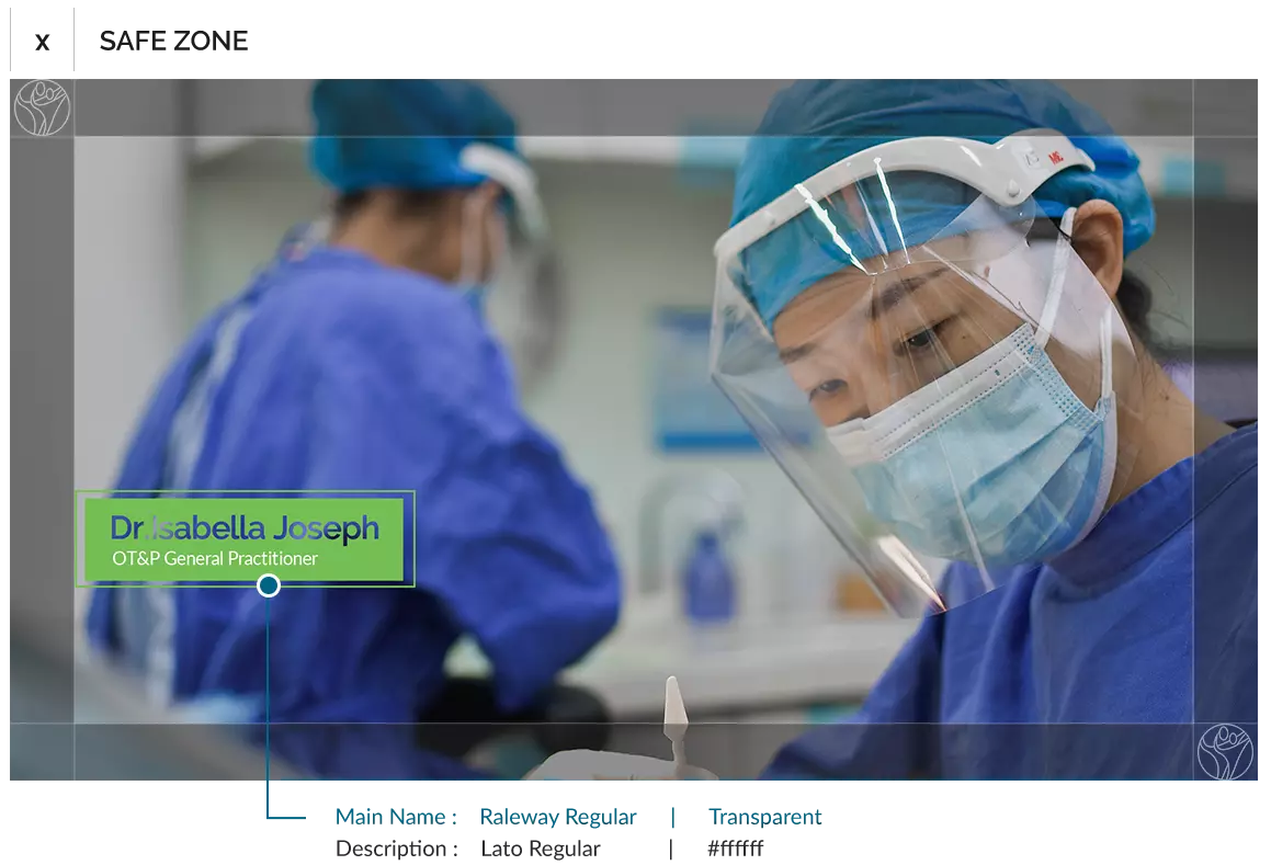
For videos with interviews, the lower third quadrant should be used to identify interviewees with their title, name and department.
Lower-Thirds
Lower thirds refers to text that is positioned on the lower third area of the screen – usually the titles of interviewees.
-
Use lower-thirds to identify people on their first speaking appearance. Identify each subject just once.
-
If a subheading, such as a title or department name, exceeds 80 characters, run it over two lines.
-
Keep text within Action/Text Safe Zone and never let text go beyond the right or left margin.
Screen Construction
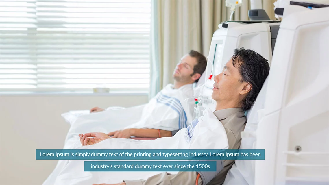
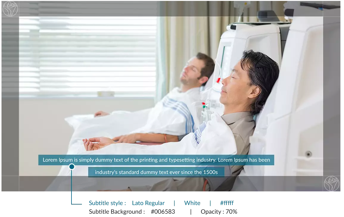
Subtitles
All OT&P videos should have a subtitle either in English or Chinese.
- The font size used will be dictated by your output size.
- Your text should be highly legible at all times even with compression applied.
- Subtitles should be centered on a blue background at 85% opacity and should not exceed two lines.
Screen Construction
Custom Thumbnails
The custom thumbnails must:
- Have a resolution of 1920x1080
- Be uploaded in image formats such as .JPG, .BMP, or .PNG.
- Remain under the 2MB limit.
- Use a 16:9 aspect ratio.
- When adding text to your thumbnail image, do not repeat the title of the video
Video Guideline - Social Media
OT&P Videos for social media platforms such as Facebook, Instagram, iGTV and Linkedin follow a similar format to universal guidelines. However, you should take into account the video dimensions for each platform. All OT&P videos should be shot accordingly which can be optimised and repurposed for respective platforms.
Video Styling
The title screen for social media videos are replaced with a direct storyline. This is important to convey the message in a limited amount of time for respective social platforms.
Closing Screen
Main Screens
Lower-Thirds
Screen Construction
Subtitles

Subtitles Construction

The social media video subtitles should use typeface Lato in the regular size of 15px.